Author: RW Boyer
If you’ve not downloaded your free copy of the comprehensive guide to fine art printing with Lightroom, get it now!
Part I Getting Into Trouble
Color management and soft proofing are an essential part of successful fine art printing, as we show in “The Art of Fine Art Digital Printing”. To illustrate just how important that is for understanding what is displayed on the screen when using soft proofing in Adobe Lightroom, I’ll walk you through a recent epic failure that happened to me for not following my own advice laid out in the eBook. The result was the waste of a huge hunk of canvas and a few gallons of ink. That’s an exaggeration, of course, but it felt like it given the cost of both of those materials.
First a simple review of the relevant advice which we (I) didn’t follow when producing a few large canvas prints for one of Les' clients (image taken by Les in Antarctica):
- You don’t need a large gamut monitor, but it may help in some cases.
- No matter how large a gamut your monitor has, paper and ink have different gamuts and color spaces.
- Using monitor gamut warning, soft proofing can indicate things you can’t actually see on a monitor, things that are going on with the paper print.
- If there are large areas of color that cannot be proofed accurately with soft proofing FIRST MAKE A SMALL PROOF PRINT
So, where did I go wrong with all of my hubris? Pretty much every step of the way! First off, I was using one of our older Apple iMacs (sRGB) as a print station in our workshop area to print. Not a problem in and of itself, the monitor is calibrated. I did take a quick look at soft proofing in Lightroom and activated monitor gamut warning just for a quick look.
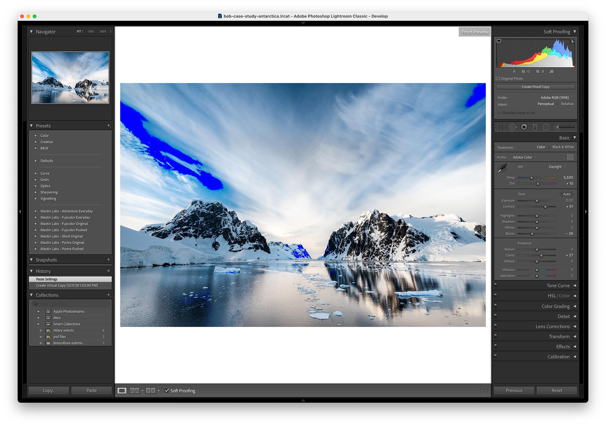
Soft proofing showed the screen below where all that blue in the sky was going to be something different than the screen was showing me. Nothing unexpected as those deep blues and greens are typically where printers have more gamut than sRGB monitors and even AdobeRGB monitors have. Take a look at the eBook color management section for a visual treatment of what that means.

Here’s where the hubris took over. Instead of looking at the soft proof on an AdobeRGB monitor which shows a lot more color in those ranges I decided to skip it. Again not a huge problem as long as I didn’t skip proofing it on a small print first, which I did. I made the assumption that the sky would be maybe a little less saturated and maybe a little darker than usual. It wasn’t.
That sky on the print was the most cartoonish solid, saturated blue that could be imagined. So much so that even if I posted an AdobeRGB version of it here or took a color accurate picture of the print and posted that here in AdobeRGB, you wouldn’t be able to see what the print looked like. Why? Most of you have an sRGB screen, or maybe P3, or maybe even AdobeRGB (which also is incapable of showing you exactly how awful it was).
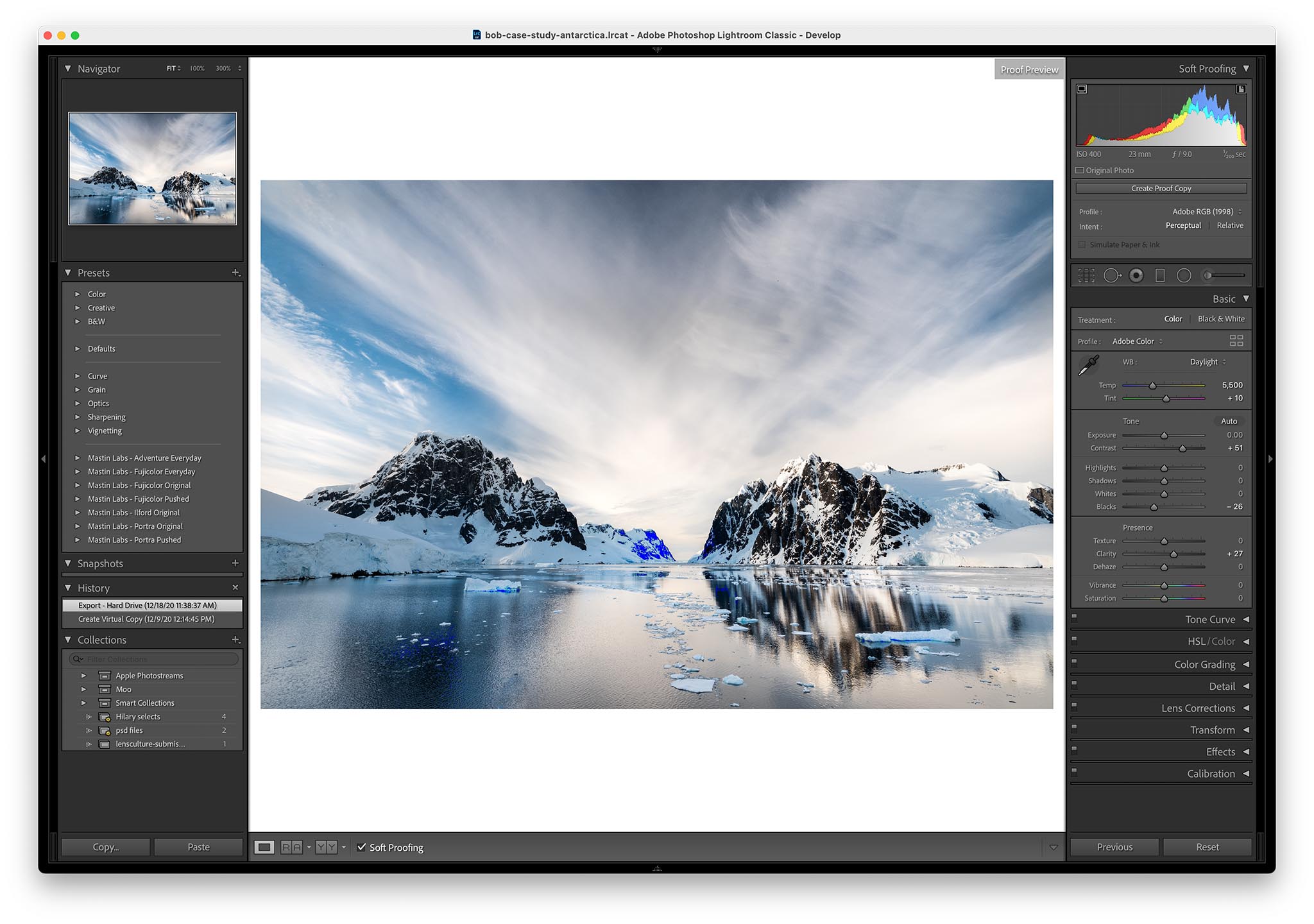
Above is what the soft proofing on an AdobeRGB monitor looked like. Still some areas that aren’t “proof-able” on screen. If I would have bothered to look at the AdobeRGB monitor even without soft-proofing I would have seen how far, far, far more saturated the sky was than what it looked like on an sRGB monitor. More importantly, if I would have taken the five minutes to make a small proof I would have known exactly what the sky looked like. I didn’t and ended up with a fairly expensive, useless and ugly print.
Part II The Fix
The second printing of that large canvas turned out great. In fact it was one of those occasions where the “technical” solution was in perfect harmony with the aesthetic solution. I’d go so far as to say that the failure inspired a more radical change than if I had bothered to proof it on an AdobeRGB monitor.
The image looked fine displayed on an sRGB monitor where the sky was a lot less saturated than the print or the high gamut monitor. We went with the obvious answer and made the image look like it did on the sRGB monitor while looking at it on the AdobeRGB monitor. A quick desaturation of the blues in the Lightroom Colors adjustment area did the trick. Going a little farther I shifted the color towards green/yellow, which had the effect of warming them up. To finish it off I bumped up the white balance a bit warmer as well (further desaturating all of the blues). Now the entire image was warmer and blues a lot less saturated than what they looked like on the sRGB monitor. That’s what I mean when I said I did a more radical change.
Of course that all could have been inspired, and done, by just making a small proof but I’ll rationalize by believing we made it better only because we made a really big mistake first!